|
1. What skills
have you developed through this module and how effectively do you think you
have applied them?
|
|||||
|
I’m not entirely sure if this classes as a skill but I
feel as though I’ve learnt the mindset children have when they’re making
pictures and this resulted in the simplification of the drawings as well as
the ability to be spontaneous and not think too much. I feel as though it has
been beneficial to me as I have become really interested in shape-based work
and I’m going to look into the idea of simplification more in future
practice. I adopted this way of working quite quickly and feel as though the
outcomes are fairly successful in communicating the idea of children playing
with whatever toys they wish, regardless of which gender they’re actually
made for. Also, it enabled me to understand that making mistakes and making
bad work isn’t always a bad thing, I feel like I changed this ‘bad work’ into
some interesting pieces of work. Furthermore, I feel like I’ve developed
skills in using Photoshop. I still don’t have much confidence with it but
decided to give it a go and actually quite enjoyed using it this time round.
This is probably because the tools and techniques I was using weren’t that
complex, but I still feel like I’ve improved.
|
|||||
|
2. What approaches to/methods of research have you
developed and how have they informed your practical outcomes?
|
|||||
|
The best form of research that I used in my project
was definitely carrying out experiments and collecting primary research
myself. This informed the rest of the work I was doing, as I was able to find
interesting features within children’s drawings. It also enabled me to be
able to try out a few different routes in terms of making pictures. For
example I used the most common stereotypical features found in the drawings
to produce child-like drawings of my own. This led to thinking like a child
and this idea of simplification as mentioned before. I then used very basic
shapes to produce stereotypical outfits and also did some swaps of gendered
toys to reflect the crossovers found in my results. In terms of my essay I
seem to have found a lot of the texts that I used online.
|
|||||
|
3. What strengths can you identify in your work and
how have/will you capitalise on these?
|
|||||
|
I think one of the strengths within my visual journal
was the collection of research to inform my ideas and possible the
exploration of different paths leading from this research. I tried a few
different ideas before focusing in on swapping the colours of gendered toys
as a way of communicating the idea that this should be acceptable in this day
and age and then making some more refined/ resolved outcomes from these
drawings. Within my essay I’d say the use of many references to back-up my
argument may be quite strong? I’m not too sure on that one.
|
|||||
|
4. What weaknesses can you identify in your work and
how will you address these in the future?
|
|||||
|
One of the biggest weaknesses I feel is the amount of
work I’m submitting. Unfortunately as I wasn’t particularly enjoying CoP I
didn’t really do much work on it until nearer the end. I was a bit lost on
where to go with things and didn’t quite grasp the concept of just exploring
and not having to make something at the end of it. After gathering research I
feel as though I had something solid to work from and this is when I start
getting into it. I don’t feel as though my essay is very strong. I seem to
waffle a lot as I always have done and after reading through it and changing
things so many times I was struggling to make sense of everything.
Additionally, the fact that I haven’t used books as reference within my essay
is worrying me. I’m not a quick reader and I find it difficult to just skim
read through a book and still understand what it’s talking about. I did
search for quite a few in the library but the ones that would have helped to
inform my essay were in use and so I kind of gave up and looked for more
research online. I did find some really good texts though, my references
aren’t just extracts from webpages.
|
|||||
|
5. Identify five things that you feel will benefit you
during next years Context of Practice module?
|
|||||
|
·
Organisation/ Time Management- Not leaving CoP
till the end- I am going to make sure to set time out for context of practice
each week next year in order to make sure that I have a solid body of work.
·
Library- I plan to take advantage of this
resource that we have, and make sure to take out books early to ensure that I
the ones that I feel are relevant to my work are still available for me to
access.
·
Research- collecting both first and secondary
research to inform the visual side of CoP. Although my primary research was
really beneficial this year, I feel like secondary research is also really
helpful.
·
Choosing Subject- I need to make sure that I choose
a topic that I find really interesting as this will ensure that I don’t just
push it aside and that I enjoy it.
·
Essay- start working on my essay earlier so
that I can get more feedback. I received some feedback quite early on and my
final essay was completely different so I’m not sure whether it’s up to a
good standard.
|
|||||
|
6.How would you grade yourself on the following areas:
(please indicate using an ‘x’)
5= excellent, 4 = very good, 3 = good, 2 = average, 1
= poor
|
|||||
|
|
1
|
2
|
3
|
4
|
5
|
|
Attendance
|
|
|
|
|
x
|
|
Punctuality
|
|
|
|
x
|
|
|
Motivation
|
|
|
x
|
|
|
|
Commitment
|
|
|
x
|
|
|
|
Quantity of work produced
|
|
|
x
|
|
|
|
Quality of work produced
|
|
|
x
|
|
|
|
Contribution to the group
|
|
|
x
|
|
|
|
The evaluation of your work is an important part of
the assessment criteria and represents a percentage of the overall grade. It
is essential that you give yourself enough time to complete your written
evaluation fully and with appropriate depth and level of self-reflection. If
you have any questions relating to the self-evaluation process speak to a
member of staff as soon as possible.
|
|||||

Thursday, 5 May 2016
OUIL401- Self Evaluation
Wednesday, 4 May 2016
More Posteryness
So I decided to try the suggestion on my feedback sheet. I'm going to put all of the images into one bigger poster. Hopefully at a first glance it'll just look like an image of gendered toys but if then you'll be able to see that the stereotypes have been reversed. You first believe you are seeing images that you're familiar with and now accept within the poster, and then realise that they are the opposite. This will hopefully encourage people to accept these changes and embrace the idea of children playing with any toy they wish, regardless of whether it's targeted to their own sex or the opposite. I wasn't sure which background colour I preferred so I'll just show all of them:


Poster Thingys


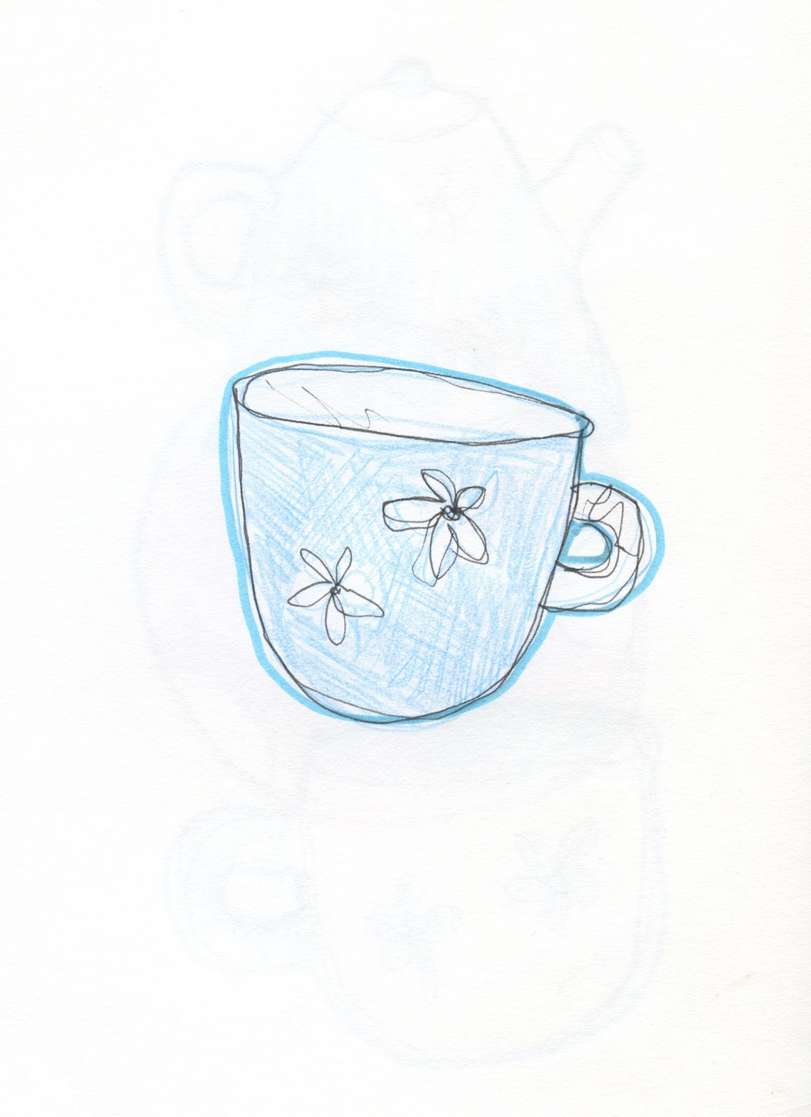
I actually really enjoyed making these and I'm pretty happy with the outcomes. Looking at them now I feel like the tea set one could have used some work. I seem to have missed gaps which I didn't realise before and it's annoying me now. I don't have enough time to go back and alter them now so they'll have to do! Also, I feel like the footballs could have been a little smaller with more of them but oh well. I think I'm being a bit picky.
Playing On Photoshop

I scanned the images in, deleted the background using the magic wand tool and then enhanced the image by changing the levels, contrast/brightness and the colour balance. Luckily all of the images fit into each other quite nicely so it wasn't too difficult to arrange everything. I flipped some horizontally so that they fit the space better. I then tested out some different coloured backgrounds as white seemed a bit boring.


Better Drawings (maybe)

I like the aesthetic of the toy soldier the most. So I decided to do some more drawings in this style and I'm going to layer them digitally on Photoshop to make some funky patterns.


Hahaha that last unicorn is just awful. But I probably would have drawn it like that when I was young so it'll be okay for these posters I think. Let's get Photoshop-ing!
Phil McAndrew
I came across Illustrator Phil McAndrews work and found a page on his website where he talks about how much he enjoys his work. I found this really lovely quote from him which is relevant to my work so I thought I'd post it on here.
'The thing that really struck me, working with a classroom full of six-year-olds, was that kids draw without any reservations or inhibitions. They just have fun and are excited about putting their ideas down on paper, about making something tangible with just a marker and their imagination. And if they're young enough, it doesn't matter how primitive or messy their drawings might look. When it comes to drawing, kids are FEARLESS.'
I feel like this will help me to make my drawings seem more realistic in terms of looking like they've been drawn by a child. I like the idea of not worrying about how messy the outcome is. I feel like this is also relevant to my practice in general. Making mistakes is important in the process of learning and I need to stop worrying too much about making bad work.
Process & More Colour Swapsies
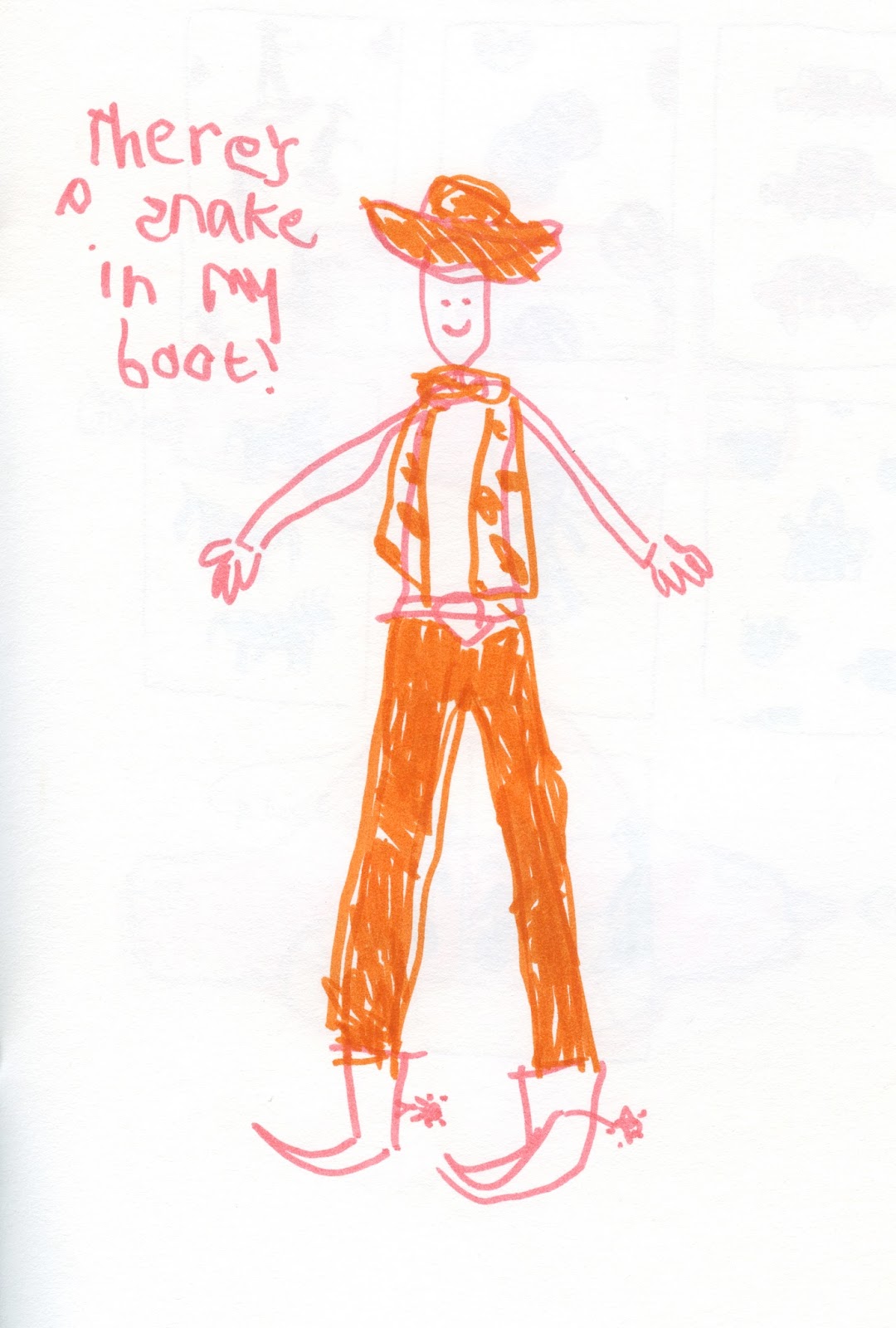
After receiving some feedback in that crit I decided to go back to the children's style drawings of toys with opposite colours. The way in which I've been doing these drawings is by holding the pen in my non-dominant hand and gripping it in my fist as this enabled me less control over the tool. It's actually more difficult that you think! I used colouring pencil and felt tip pens in order to get the same effect as kid's drawings. I feel as though I probably have added certain details that kids wouldn't really pick up on but it was difficult to forget everything I'd learnt over the years and just draw without thinking or studying the subject too closely. I don't think these drawings are too bad but I'm going to try drawing from memory rather than from a picture as I feel this will help in producing something a little simpler and more child-like.


Critttt
Feedback:
1. Comment on the relationship between the content and practical responses so far.
1. Comment on the relationship between the content and practical responses so far.
- Interesting and different approach by getting kids to do drawings
- I like the ink drawings and the naive style
- The body of work is all linked to the idea of gender stereotypes and challenging the ideas e have of what is for boys and what is for girls.
2. Comment on the clarity with which the visual responses and theory are connected. how and why does one process inform the other?
- Theory carried through to experiment with children's drawings
- Results from Lydia's drawings informed your direction? Less stereotypical than you had expected perhaps?
- I like the idea in the second sketchbook, clearly communicating obvious stereotypes, but then looking at stereotypes cross-overs- the 'boys' toys in pink work well.
3. Comment on the visual quality of the practical responses.
- By drawing in naive, child-like style clearly communicates your idea of stereotypes being enforced from a young age.
- I like the visual quality of the boys and girls toys- I think this idea could be taken further to more resolved outcomes
- bigger prints, with the toys layered or pattern
- pink/ purple next to blue/green, but when you look closer the toys don't correspond with the stereotypical colours.
4. What issues need to be addressed ahead of submission deadline?
- Develop the ideas from the sketchbook to more resolved outcomes- bigger?
I agree that I need some more resolved outcomes. I've liked layered patterns in my sketchbook as well so I might re-draw some toys or draw some more and start to layer them in Photoshop. Thanks Pal!
Outfits
I thought what the males and females in the drawings were wearing was interesting in my experiment. I decided to pick out the key elements that make up the outfits for each person (boy, girl, man, woman) and simplify these right down into basic shapes. I also switched the colour you'd put with each genders clothing to the opposite colour as I did with the toys as I thought this was interesting. I made detachable heads, one male and one female for each outfit. The outcomes are shown below:


Interestingly, I think the male outfits in pink seem to work with both genders. For example with the first outfit shown, I feel like boys wearing pink and girls playing football is now acceptable in society, however with the next image- the girls outfit in blue- the boys face seems out of place on the body of a girl. This brings me back to the same idea mentioned in the previous post about it being acceptable for girls to play with or use things made for boys, however boys don't tend to use girls stuff. Pete mentioned an article that talked about this idea, but he can't get hold of it unfortunately. I'll see if I can find it online somewhere.
Reversing Colours & Toys
One of the most obvious stereotype is that all girls like pink and all boys like blue. I wanted to focus in on this a little more. I decided to take toys that targeted boys but draw them in pink and purple and the same with the girls toys, but with the colours blue and green, similar to what Paul Windle has done. I didn't use red purposely with these ones as I feel as though red is a gender neutral colour that is associated with both.


I quite like these outcomes. I feel like the boys toys in pink seems a little more natural than the girls toys in blue. I'm not sure why this is. It could possibly be because we do now get pink footballs and cars, as it's become acceptable for young girls to play with these toys. However, it doesn't quite work the same way for the girls toys in boys colours. There are many blue versions of girls toys which is interesting. I'm not entirely sure why this is, but I might look into it if i have time.
Subscribe to:
Comments (Atom)