Tuesday, 31 October 2017

Practical Peer Review Prep

Research Question:

How can the aesthetics of simplicity be used to communicate complexity?

Summary of Research Project:

This research project will explore the boundaries of simplicity and how the aesthetics of this can be used to provide a better understanding of complex ideas. Research into this form of visual communication will focus heavily on the use of metaphor and shape-based imagery which will proceed to drive the practical response to the project. I aim to identify through my findings whether the aesthetics of design can complicate the overall communication of an image. I also intend to discover how far an image can be pushed through the process of simplification and where the limit lies before meaning is lost. 

Quotes:
  • 'There are limits on how far simplicity of structure can be taken and it is exciting to push things to these limits'
  • 'The growing use of symbols on a worldwide scale demands absolute clarity of expression'
  • 'This business of two or more images in one must be taken into account by the graphic designer when he is trying to achieve really concentrated visual communication'
Munari, B. (2008). Design as art. London: Penguin Books.

Sunday, 29 October 2017

Less is More - Steven Heller & Annie Fink (1999)

Key Notes & Quotes:
  • Tendency to use "more is more" in graphic design - rebellion by one generation - don't want to conform - p.8
  • Technology - 'giving designers the tools to make both elegant and convoluted complexity, depending on their respective levels of taste and talent.' - p.8
  • Alphas began seeking out alternatives -
    • 'Simplicity, economy and reduction is one such alternative, not only as a rejection of fashion, but to enhance effective communication.' - p.8
  • 'Simplicity offers at least as many variations as complexity.' - p.8
  • 'The presumption that simplicity is pure functionalism is erroneous.' - p.8
  • '"Less is more" may be the absence of unnecessary complexity, while retaining design elements that further effective communication.' - p.8
  • 'What this work reveals is that "less is more" is not an overriding style but the sum of many points of view.' - p.8
  • 'Simplicity means a return to basics but not at the expense of excitement.' - p.8
  • The maxim "less is more" - was coined by architect Ludwig Mies van der Rohe - p.11
  • 'Simplicity is usually synonymous with legibility in graphic design, and yet legibility is not always the most effective (or eye-catching) way to communicate.' - p.12
  • 'Sometimes messages are made more enjoyable, and are better remembered.' - p.12
  • 'The merits simplicity or complexity really depend on specifics, like the nature of the message and the audience.' - p.12
The Simple Truth
  • 'Graphic design originated as complexity and over time was reduced down to fundamental' - p.12
  • An exhibition of reductive commercial design organised by the Circle of New Advertising Design revealed new form more exciting and also that it's functionalism made promotion and publicity more accessible.' - p.13
  • 'A page without a iota of irregularity was not as inviting as one with quirks.' - p.14
  • 'Yet some of the changes in attitude espoused by Bauhaus teachers- form follows function, for example- were assimilated into much broader realms of design thinking and philosophy.' - p.14
  • Paul Rand - 'He reasoned that just because a visual message has multiple levels of meaning, it need not be weighed down by visual detritus.' - p.14
  • Armin Hoffman - '"In the realm visual communication, excess of expense and pomp do not necessarily lead to gains in clarity".' - p.18
  • ''Rational, objective and reductive design not only allows for clear communication but signifies social responsibility.' - p.18 
  • 'In the corporate realm, reduction was essential for clear internal and external communications.' - p.19
  • Helvetica - 'Simplicity was the panacea for visual confusion, but it was also a recipe for dull design.' - p.19
  • 'Whereas "less is more" was the modern credo, the post-modernist literally exposed design as being more than meets the eye. Complexity was not merely a knee-jerk reaction to the past, but part of a critical discourse of the nature of visual communications.' - p.21
  • 'Making complex design is no longer as effective as it was when everything was more or less simple; in fact, it is not as much fun to make things relatively complex.' - p.25
The New Simplicity - Identity
  • 'A logo must be simple. As the symbol of a corporation, business or organisation, it embodies complex ideas and of the same is iconic- a veritable brand for those ideas.' - p.85
  • 'While the reductive logo has not disappeared, more complex marks have reemerged- and some work very well. But, ultimately, complexity offers diminishing return when the memorability is the goal. Simplicity continues to be the root of a logo's mnemonic power.' -p.85

Saturday, 28 October 2017

Saudade (Portuguese) - Roughs

Definition: A somewhat melancholic feeling of incompleteness, longing for something that might never return.

  • Negative space = missing piece, can never return as it was never there to begin with - 'incompleteness' / 'might never return'
  • Heart/ hand = 'longing' 
  • Dark/ block colour = 'melancholic' - research colours

Schadenfreude (German) - Roughs

Definition: Pleasure derived from someone else's pain or misfortune.

  • Zigzag = lightning bolt - 'misfortune' 
  • Two halves/ two faces = two people involved - 'someone else's'
  • Left face = sad - 'pain' 'misfortune' 
  • Right face = evil/ happy - 'pleasure'
  • Lines for facial features kept simple to not over-complicate.
  • Research colours that represent the above- maybe red and grey/blue?
Could potentially make this into a gif. Symbol slowly turns upside down to reveal both faces. 

Litost (Czech) - Roughs

I started with the 3 examples shown in my previous post about untranslatable emotions. Some of the words in the list are really interesting!

To begin with, I wrote down the word and definition. I then underlined the key words within each sentence to give me specific visual cues to work with. This made it a lot easier when attempting to communicate the whole idea in one simple image. As discovered previously, I found visual metaphors to be a really useful tool for this task. It allows me to incorporate all elements of the definition without over-complicating things- which is essentially the aim of my project as a whole. 

Litost (Czech):
Definition: A state of torment created by the sudden sight of one's own misery.

  • Single eye = one person - 'one's own'
  • Sad face within iris = 'misery', also like a reflection 
  • Iris doesn't touch outer eye = creates illusion of wide eyes - 'sudden'
  • Sharp lines = 'torment'
  • Tear = 'misery' 
........
I'm not sure whether each image would work without the text alongside it. However, does having to use text to further explain the image defeats the object of this project? This is something to think about. 

Thursday, 26 October 2017

Untranslatable Emotions

https://www.collinsdictionary.com/word-lovers-blog/new/14-untranslatable-emotions-that-english-cant-convey,155,HCB.html

I did a bit of research into some untranslatable emotions as I was getting a little bored of drawing verbs (after two attempts). It's so interesting that other languages have words for things that we don't. Most of them are quite obscure which might either make them easier to communicate visually, or more difficult, but I guess we'll find out. 

Here are some examples:
  • Litost (Czech) - A state of torment created by the sudden sight of one's own misery
  • Schadenfreude (German) - Pleasure derived from someone else's pain or misfortune
  • Saudade (Portuguese) - A somewhat melancholic feeling of incompleteness; longing for something that might never return
I am going to start with these words first. I have underlined key words within the definition for each one to give me more to work with when trying to translate these into images. 

Tuesday, 24 October 2017

Group Tutorial 2

Today I had a second group tutorial with Jamie and some of my peers. I showed the couple pages of practical work I had done so far and explained how I think I've been too focused on the idea of each symbols being easy to understand by everyone, in a similar way to traffic signs and information graphics. This has caused the symbols to look a bit uninteresting and has also meant that it hasn't been much fun. I think this might be because of the words I had chosen. Instead of just finding a list and going through each one, I picked out words that seemed doable. The feedback from the session was to focus on the practical work for a bit, as my project is very much process-driven. It was suggested that I find a list of verbs and work fast and intuitively, attempting to illustrate a verb an hour. This will give me a bit of a boost and will enable me to find common themes and techniques of simplification that will inform and assist the creation of the rest of the symbols. Furthermore, we discussed not looking into colour as this broadens the focus of the essay too much. I will just be looking at form. 

I also need to make a start on constructing an essay plan. 

Tasks:
  • Find a list of verbs - illustrate 1 per hour
  • Start making an essay plan
  • Research - how metaphors are learnt, shared and work
  • Research - What the role of simplicity is

Sunday, 22 October 2017

Design As Art - Bruno Munari (1966)

Key Notes & Quotes:
  • Seurat - 'The literary element in a visual work of art was the first to be discarded in favour of pure visuality' - p.11
  • Arisits abandoning safe traditional techniques - 'to create an art for everyone' - p.12
  • 'There should be no such thing as art divorced from life, with beautiful things to look at and hideous things to use.' - p.25
  • Walker Gropius - Bauhaus prospectus: 'our task is to make a new kind of artist, a creator capable of understanding every kind of need... because he knows how to approach human needs.' - p.27
  • 'The first school of design did tend to make a new kind of artist, an artist useful to society' - p.27
  • 'When the objects we use everyday and the surroundings we live in have become in themselves a work of art, then we shall be able to say that we have achieved a balanced life.' - p.27
What is a Designer?
  • Give right weight to each part of the project
  • Knows the ultimate form of the object is psychologically vital. 
  • Tries to give it a form that is as appropriate as possible to it's function.
  • Thinks about:
    • Materials
    • Production
    • Techniques
    • Calculation of cost 
    • Psychological & aesthetic factors  -p.30
  • Bruno - believes that the beauty of an object lies in the functionality and ability to do exactly what it was made to do and do it well. - p.30-31
  • Artist used to be called upon to make works of communication- now call upon designer. - p.31
Why Designer and not Artist?
  • Designer knows about printing, techniques used etc. 
  • Use forms and colours according to their psychological functions.
  • 'The designer is therefore the artist of today... works in such a way as to re-establish contact between art and the public.' - p.32
  • Jean- Baptiste Lamarck - 'The form follows the function.' p.33
  • Visual design - 'images whose function is to communicate and inform visually: signs, symbols, the meaning of forms and colours and the relations between these.' - p.33
A Living Language
  • 'It is a well known fact that to get a message across we can not only use words but in many cases also images, forms and colours, symbols, signs and signals.' - p.37 
A Rose is a Rose 
  • The growing use of symbols on a worldwide scale demands absolute clarity of expression.' 
  • 'If a visual message is going to get across to people of different languages and backgrounds it is essential that the message does not lend itself to wrong interpretations.' - p.41
  • 'We all have inside us (naturally with some variation from person to person) groups of images, forms and colours which have exact meanings.' - p.43
The Stylists 
  • Example - Re-designing a car that is no longer selling- keep inside the same (function), change outside to appeal to people of the time (aesthetics). - p.47
Variations on the Theme of the Human Face 
  • 'Different techniques provide variations on the face- features stay the same but are structured differently' -p.55 - practical work idea? 
Two in One 
  • Can see things within other things i.e. pictures in clouds - p.72
  • 'This business of two or more images in one must be taken into account by the graphic designer when he is trying to achieve really concentration visual communication.' - p.72
  • Has a lasting effect - seems to the viewer to be a private acquisition - a personal discovery beyond what was obvious to obvious. - p.72
A Language of Signs & Symbols
  • Many of our activities today are conditioned by signs and symbols 
  • So far only used for visual communication and information - p.78
  • Express ourselves by means of signs and symbols 
  • Combine signs e.g. ideographic scripts of China and Japan -
    • In these ancient scripts signs have one value on their own and another when used in combination - when used together, create narrative - p.78
  • Hobo-signs as practical example?
  • Variations of trademark of the Club degli Editori emblem of a fish - sketches were made to see how far it could be changed and still remain recognisable - p.98
A Spontaneous Form 
  • 'There are limits on how far simplicity of structure can be taken and it is exciting to push things to these limits' - 116 
  • Examples of simplification - The arrow:
    • Realised that all one's attention should be concerned with the point of the arrow - the part that actually conveys the message. The rest could be eliminated. - p.201

Saturday, 21 October 2017

Practical - Verbs

For the practical element of this project I am going to start by illustrating verbs in simple forms. In my first group tutorial we discussed how it would be more interesting to try and draw verbs as symbols rather than just nouns, as verbs possess a further level of complexity. I made a start by finding a huge list of verbs and picking some to try and communicate with the aesthetics of simplicity in mind. 

Alert: 
The first word I tried was 'alert' - which may have been a bit of a silly choice as there are already a lot of signs and symbols that communicate something similar. This meant I had to ignore ideas and images that I'd seen before and try to create something a original and a little more interesting. I tried to do this a little by using negative space. I also decided to incorporate colour as I felt as though this would make it a lot easier to communicate the right tone. The colour red to me signifies 'danger' which I think closely relates to the word 'alert'. 

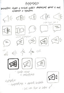
Announce:
The second word I tried was 'announce'. This one was a lot more fun, probably because I ended up creating some visual metaphors. Metaphor is definitely something I was to research and talk about within my essay as I feel that it a great way to communicate complex ideas or multiple ideas in one single image. The symbol in the black frame was what I thought to be the final one, however, after looking at it for a bit, I wasn't sure that it communicated the word 'announce' well enough. The addition of the three lines on the right bring the image to life and show that it communicates an action. 

Tuesday, 17 October 2017

Information Visualization: Perception for Design - Colin Ware (1999)

Key Quotes:
  • 'As Hutchins (1995) so effectively pointed out, thinking is not something that goes on entirely, or even mostly, inside people's heads. Little intellectual work is accomplished with our eyes and ears closed. Most cognition is done as a kind of interaction with cognitive tools, pencils and paper, calculators, and increasingly, computer-based intellectual supports and information systems.' p.8
  • 'Visualizations have a small but crucial and expanding role in cognitive systems.' p.8
  • 'We acquire more information through vision than through all of the other senses combined. The 20 billion or so neurons of the brain devoted to analyzing visual information provide a pattern-finding mechanism that is a fundamental component in much of our cognitive activity.' p.8
  • 'One of the greatest benefits of data visualization is the sheer quantity of information that can be rapidly interpreted if it is presented well.' p.8
  • 'Visualization provides an ability to comprehend huge amounts of data. The important information from more than a million measurements is immediately available.' p.9
Visualization Stages:
  • 'In general, algorithms are discussed only insofar as they are related to perception. The computer is treated, with some reservations, as a universal tool for producing interactive graphics. This means that once we figure out the best way to visualize data for a particular task, we assume that we can construct algorithms to create the appropriate images. The critical question is how best to transform the data into something that people can understand for optimal decision making.' p.11
Experimental Semiotics Based on Perception:
  • 'about the science of visualization, as opposed to the craft or art of visualization.' p.11
  • 'Some scholars argue that visualization is best understood as a kind of learned language and not as a science at all. In essence, their argument is that visualization is about diagrams and how they can convey meaning. Generally, diagrams are held to be made up of symbols, and symbols are based on social interaction. The meaning of a symbol is normally understood to be created by convention, which is established in the course of person-to-person communication. Diagrams are arbitrary and are effective in much the same way as the written words on this page are effective-we must learn the conventions of the language, and the better we learn them, the clearer that language will be.' p.11-12
  • 'the debate can help us define where vision research can assist us in designing better visualizations, and where we would be wise to consult a graphic designer trained in an art college.' p.12
Semiotics of Graphics:
  • 'some visual languages are easier to "read" than others. But why?' p.12
  • Saussure -  'He defined a principle of arbitrariness as applying to the relationship between the symbol and the thing that is signified.' p.12
  • 'truth is relative to its social context. Meaning in one culture may be nonsense in another. A trash can as a visual symbol for deletion is meaningful only to those who know how trash cans are used.' p.12
  • Levi-Strauss, Barthes and Lacan - 'have developed the theory that all meaning is relative to the culture. Indeed, meaning is created by society.' p.14
  • 'Languages are conventional means of communication in which the meanings of symbols are established through custom. Their point is that no one representation is "better" than another. All representations have value. All are meaningful to those who understand them and agree to their meanings.' p.14
Pictures as Sensory Languages:
  • 'There has been a debate over the last century between those who claim that pictures are every bit as arbitrary as words and those who believe that there may be a measure of similarity between pictures and the things that they represent. This debate is crucial to the theory presented here; if even "realistic" pictures do not embody a sensory language, it will be impossible to make claims that certain diagrams and other visualizations are better designed perceptually.' p.14
  • Nelson Goodman (1968) - '"Realistic representation, in brief, depends not upon imitation or illusion or information but upon inculcation. Almost any picture may represent almost anything; that is, given picture and object there is usually a system of representation-a plan of correlation under which the picture represents the object."' p.14
  • 'the best approach to designing visual languages would be to establish graphical conventions early and stick to them.' p.14
  • Kennedy (1974) - 'In the case of the reported puzzlement of people who are seeing pictures for the first time, Kennedy argues that these people are amazed by the technology rather than unable to interpret the picture. After all, a photograph is a remarkable artifact. What curious person would not turn it over to see if, perhaps, the reverse side contains some additional interesting information?' p.15 
Sensory versus Arbitrary Symbols:
  • 'the word sensory is used to refer to symbols and aspects of visualizations that derive their expressive power from their ability to use the perceptual processing power of the brain without learning.' p.16
  • 'The word arbitrary is used to define aspects of representation that must be learned' p.16
  • 'Sensory representations are effective (or misleading) because they are well matched to the early stages of neural processing. They tend to be stable across individuals, cultures, and time. A cave drawing of a hunt still conveys much of its meaning across several millennia. Conversely, arbitrary conventions derive their power from culture and are therefore dependent on the particular cultural milieu of an individual.' p.16
  • 'because we all have the same visual system, it is likely that we all see in the same way, at least as a first approximation. Hence, the same visual designs will be effective for all of us.' p.18
  • 'This distinction between the sensory and social aspects of the symbols used in visualization also has practical consequences for research methodology. It is not worth expending a huge effort carrying out intricate and highly focused experiments to study something that is only this year's fashion. However, if we can develop generalizations that apply to large classes of visual representations, and for a long time, the effort is worthwhile.' p.18-19
Arbitrary Conventional Representations:
  • 'Arbitrary codes have the following characteristics:
    • Hard to learn
    • Arbitrary codes are by definition socially constructed - 'In contrast, sensory codes cannot be forgotten. Sensory codes are hard-wired; forgetting them would be like learning not to see. Still, some arbitrary codes, such as written numbers, are overlearned to the extent that they will never be forgotten. We are stuck with them because the social upheaval involved in replacing them is too great.' p.22
    • Embedded in culture and applications - 'The use of color codes to indicate meaning is highly culture-specific.' p.22
      • 'Many graphical symbols are transient and tied to a local culture or application. Think of the graffiti of street culture, or the hundreds of new graphical icons that are being created on the Internet.' p.22
      • 'We have many standardized visualization techniques that work well and are solidly embedded in work practices, and attempts to change them would be foolish. In many applications, good design is standardized design.' p.22
      • 'Culturally embedded aspects of visualizations persist because they have become embedded in ways in which we think about problems.' p.22
    • Formally powerful - 'the fact that something is expressed in a visual code does not mean that it is easy to understand.' p.23
    • Capable of rapid change - 'Sensory codes are the products of the millions of years it has taken for our visual systems to evolve. Although the time frames for the evolution of arbitrary conventional representations are much shorter, they can still have lasted for thousands of years (e.g., the number system). But many more have had only a few decades of development. High-performance interactive computer graphics have greatly enhanced our capability to create new codes.' p.23
The Study of Arbitrary Conventional Symbols:
  • 'For the visualization designer, training in art and design is at least as useful as training in perceptual psychology. For those who wish to do good design, the study of design by example is generally most appropriate. But the science of visualization can inform the process by providing a scientific basis for design rules, and it can suggest entirely new design ideas and methods for displaying data that have not been thought of before. Ultimately, our goal should be to create a new set of conventions for information visualization, based on sound perceptual principles.' p.23-24
A Model of Perceptual Processing - Stage 1: Parallel Processing to Extract Low-Level Properties of the Visual Scene:
  • 'Visual information is first processed by large arrays of neurons in the eye and in the primary visual cortex at the back of the brain. Individual neurons are selectively tuned to certain kinds of information.' p.26
  • 'If we want people to understand information quickly, we should present it in such a way that it could easily be detected by these large, fast computational systems in the brain.' p.27
Conclusion:
  • 'New symbol systems are being developed constantly to meet the needs of a society increasingly dependent on data. Once developed, they may stay with us for a very long time, so we should try to get them right.' p.33
  • 'If the best representation is simply the one we know best because it is embedded in our culture, then standardization is everything-there is no good representation, only widely shared conventions.' p.33

Wednesday, 11 October 2017

Individual Progress Tutorial

Today was my first individual progress tutorial for Cop3. So far I've been struggling with coming up with a question that is concise but represents exactly what I have been researching and thinking about. So, the main focus of today's tutorial was to spend some time figuring out what that could be. 

I have been thinking about the feedback I got in my first group tutorial and the idea to look into the relationship between forms and shapes/ the importance of context, however, I'm not sure this is something I am super interested in. I struggle a little with CoP and have stressed the importance of having to enjoy the subject I am looking into and have realised that I am more interested in the process of simplification and the aesthetics of this

Potential Question:

'How can the aesthetics of simplicity be used to communicate complexity?'

This doesn't mean I am going to fully disregard the previous idea, context with most likely make it's way into my essay as this is an important factor in the functionality of signs and symbols.

Tasks:
  • Research Gestalt Perception - design
  • Research Bruno Munari - Design as Art

Saturday, 7 October 2017

Lance Wyman - Graphic Designer

http://www.lancewyman.com/projects?id=82
  • Interesting that they are based on an action but there is no indication of movement - super simple but still communicate well.
  • Some obvious, for example basketball, netball etc. However would be difficult to understand- if seen on their own- as an Olympic sport e.g. shooting, cycling. These rely on context - more easily understood when among others.
  • In some the design has been more thought out and I personally think are more interesting to look at - Hockey, fencing, weightlifting. Still communicates the sport well. Doesn't have to just be function over form- can be both. 

Article - Lance Wyman and the Mexico City Metro (2015)
https://www.creativereview.co.uk/lance-wyman-and-the-mexico-city-metro/
Key Quotes:
  • 'recognised the need for station identification symbols that could be read not only by people with poor or non-existent literacy skills, but also by visitors from non-Spanish speaking countries.' - need to be easily understood by everyone.
  • 'if you can’t say what a visual symbol is, it will need to be accompanied by language.' -  can be accompanied by text to maximise understanding
  • 'Wyman reasoned that an abstract symbol, or one that could not be expressed verbally, would have been far less effective.'

Article - Interview with Graphic Designer Lance Wyman (2015)
https://www.designboom.com/design/lance-wyman-interview-10-14-2014-2/
Key Quotes:
  • 'what is the attraction of designing logos for you? - the challenge of communicating layered messages through minimal form.'
  • 'what mistakes or ‘traps’ should a young designer avoid when working on a logo design? - don’t overlook the obvious. designers too often neglect exploring ideas because they seem to obvious, trite, corny, etc. when the obvious is transformed into a new image it can be powerful and easily understood.'

It was really useful looking at Lance Wyman's work - his graphic design is a perfect example of the themes that I am looking at in this project, these being; communication, simplicity, signs, symbols etc. The Olympic symbols that he designed show how complexity can be expressed in shape-based, simple forms and have given me inspiration for creating my own. Learning a little about his process through the articles looked at has also given me a better insight into how to go about producing the practical work for this project. 

Wednesday, 4 October 2017

CoP3 Presentation & Group Tutorial 1


Above is my presentation, put together for my first group tutorial. It outlines some ideas I've had about what my dissertation might focus on this year. I've also incorporated slides about where these ideas have come from, research that I have carried out so far and where I think the practical element of CoP3 might go. 


The feedback I received today was actually really useful. I've been a little lost with what to focus my project on and today has given me some more ideas and clarified things a little. Initially I wanted to look into the process of simplification and whether the meaning that an image conveys is affected when the visual perception of it has been simplified. Furthermore, I wanted to explore where the limit was. At what point does this sign no longer represent what it initially did? When has the process been pushed too far? My ideas for the practical side of things were to take an object and repeatedly draw it, simplifying more and more each time until I reach a point or potentially pass the point where its at its most reduced form before losing meaning. However, I felt as though this process had been done many times before and the whole idea needed more depth. 

Jamie and my peers suggested I look into the relationship between forms and shapes- an idea sparked from an example shown in my presentation of a double-page spread from artist Warja Lavater's fairy tale interpretations (See previous post 'Warja Lavater - Image Analysis' - 15/08/17) . She communicates narrative using dots of different colours, size and placement. On their own, each of these dots simply represents a dot, however, when placed amongst other dots that differ slightly they serve a purpose and communicate key elements within the story.


So my project is now going to focus on the relationship between forms/ shapes. (More on this later!)