Friday 24 November 2017

Pisan Zapta (Malay) - Roughs

Definition: The time needed to eat a banana.

  • Banana = 'banana'
  • Clock = 'time' 
  • Chewing = 'eating' 
  • Visual metaphor - banana forms clock or hands of clock 
I think having done this quite a few times now, my brains isn't working properly and I'm running out of ideas. I think I might select some now to start making them digitally as this could take some time. 

Lagom (Swedish) - Roughs

Definition: Not too much and not too little, just the right amount of anything. 

  • Scales = 'right amount' - balance
  • Shape - simplicity 
  • Circle in center, perfect size within the frame
  • OK hand gesture - perfect size circle inside
This ones seems a little too simple and may make the others look too complex. 

Saturday 18 November 2017

Kaapshljmurslis (Lithunanian) - Roughs

Definition: Being cramped in public transport during rush hour. 

  • Bus/ window = 'public transport'
  • Multiple buses = 'rush hour'
  • Location symbol = travelling
  • Hands holding rail = 'cramped'
  • Represent people using shapes - simplicity
  • Shapes all fit together = 'cramped' 
  • More about actual feeling experienced 
  • One shape in different color? 

Arbejdsglæde (Danish) - Roughs

Literally work happiness, the feeling of happiness provoked by a satisfying job. 

  • Briefcase/ suit = 'work'
  • Smiley face/ thumbs up = 'happiness'/ 'satisfaction'
  • Tie = 'work' - flicks up to represent 'happiness'
  • Visual metaphor - thumbs up and holding briefcase. 
This is one I didn't enjoy doing because it proved to be a little more difficult than some of the others. I struggled with ideas of how to represent 'work' other than in a typical business sense.

Psithurism (Greek) - Roughs

Definition: The sound of the leaves rustling in the wind. 

  • Leaves = 'leaves' (obviously)
  • Music notes/ treble clef = 'sound' 
  • Spread across frame - 'rustling'/ 'wind'
  • Visual metaphor - notes/ treble clef within leaves 
  • Visual metaphor - Leaves make up shape of treble clef
I don't like this one. I think it feels a bit overly complicated but I'm struggling with other ways to represent the definition. I'll move on. 

Wednesday 15 November 2017

Gokotta (Swedish) - Roughs

Definition: To wake up early in the morning with the intention of going outside to hear the first birds sing.

  • Bird = 'birds'
  • Clock = 'wake up'/ 'early in the morning' 
  • Open beak = 'sing' 
  • Sunrise = 'early in the morning' 
  • Visual metaphors - beak as hands of clock
  • Visual metaphor - clock as sunrise 

Hygge (Danish) - Roughs

Definition: The comfort of enjoying food and drink with friends and family. 

  • Shapes used to represent people
  • Multiple people = 'family and friends'
  • Plate/ glass = 'food and drink'
  • Heart = 'comfort'/ 'enjoying'
  • Circles - simplicity 

Tuesday 14 November 2017

Signs and Symbols in Graphic Communication - Martin Krampen (1965)

Key Quotes:
  • 'Effective graphic communication should leave no room for different interpretations. Its function is to communicate a message in the most effective, direct way. Thus in graphic communication, the application of signs and symbols has become increasingly important.' - p.4
  • 'Visual communication is more widespread than ever. Pictorial signs are used, for example, to teach language to children, to communicate helpful information across language barriers to people in underdeveloped countries, and to persuade the sophisticated urbanite to choose brand X rather than brand Y.' - p.6
  • 'once a decision has been reached to use pictorial signs or symbols, the design itself becomes a problem. How much detail should a pictograph contain? What graphic technique should be used for a new symbol? Is the symbol "strong" enough to communicate in the presence of distracting "visual noise?"' - p.6
  • 'Visual Communication... can be seen as an attempt to inform or persuade, aimed primarily at the eye of the receiver.' - p.8


Graphic Communication and Perception

  • 'Perceptual psychology helps us lay the theoretical groundwork by telling us what causes the perceiver to see the graphic forms as a recognizable figure, distinct from its background.' - p.9
  • 'Thus we learn that the boundary or contour of the figure is of paramount importance. Such boundaries or edges of both objects in space and silhouettes or outlines on paper have one important feature in common: at these edges, a more or less abrupt change in luminosity takes place. That is, each time our eyes are confronted with a sufficiently sharp break in luminosity, we tend to see the edge or boundary of a surface. This mechanism of perception is the reason that silhouettes and outline drawings can func- tion as substitutes for three-dimensional arrangements.' - p.9
  • 'Most edges that function as object boundaries refer only to one surface in one direction at a time. An exception is the so-called "reversible figure" in which figure and ground appear to alternate as one inspects the picture. Two edges moving in opposite directions in a sign will form contradictory perceptions, as in the so-called "impossible objects."'' - p.9
  • 'the entire configuration or organization of the picture (the "Gestalt") that deter- mines what will be perceived as figure and what as ground.' - p.9


Graphic Communication and Semantics - Signs in graphic communication 


  • C. W. Morris - Signs, Language and Behaviour (1946) - p.12
  • 'Since logograms are independent of speech sounds, they have the important property of communicating across language barriers.' - p.12-13
  • 'silhouette of the man refers to the "real object" by resemblance and is called a "pictograph" 

Special Problems Imposed by the Audience - Communication with Mass Audiences of Low Literacy
  • 'Suppose one were to try to show a foreign rural population how to improve its health and farming practices, how would one proceed? To distribute printed literature would be useless. Unless a large staff trained in the language of the audience were available or unless the people could be exposed to mass media (such as radio and television), the only communication possible is through pictures.' - p.17 
  • Limitations? - 'research on the educational effectiveness of pictorial material used in South America in the 1950's.* These studies suggest that illustrations as such have no educational value unless their content relates to the past experience of the intended audience.' - p.17
  • 'Realistic color can add to illustrations as an attention-getter, and captions should be used to extend the meaning of the picture rather than to explain it.' - p.17
  • 'Thus, simplicity and realism seem to be the keys to effective pictorial communication with an audience of low literacy.' - p.17
  • 'Another study conducted in rural Brazil suggests why simplicity and realism are so important.' - 'More particularly, the selection of detail was most important in making pictorial symbols more comprehensible for younger people of limited schooling. Either extreme - inclusion of unnecessary detail or deletion of important detail - reduces comprehension.' - p.18
  • 'The study therefore recommends bold and clear designs containing only the necessary details and a minimum of artistic interpretation.' - p.18
  • 'Arbitrary symbols (diagrams such as the dollar sign) are to be avoided because they obviously depend on prior learning.' - p.18
  • 'For the design of pictorial signs used in communication with such mass audiences... the designer should follow the rule of ''simplified realism." One might profitably start from silhouette photographs of objects, perhaps printed with strong contrasts, and then by subtraction (blanking out of unnecessary detail) obtain silhouette pictographs.' - p.18


Communication with Sophisticated Audiences: The Rhetoric of Visual Communication

  • 'if a graphic designer represents a photographic organization in a trade-mark by a section through a set of lenses, he uses the classical rhetorical figure of metonymy (substitution of cause for effect, sign for thing signified, etc.).' - p.18
  • 'The effectiveness of metonymic symbolism will depend on the degree of popular understanding of the relation between the substitute and the object for which it stands.' -p.18

Communication with Many Language Groups Simultaneously: Conventionalized Picture Language
  • 'Since the industrial revolution, the necessity to communicate across language barriers has constantly increased, new means of transportation have increased the frequency and ease of international travel. Organizations such as the United Nations, and international gatherings like the World's Fairs and Olympic Games pose special communications problems.' - p.20

The International system of typographic picture education (ISOTYPE)
  • 'Another systematic attempt to design an international picture language was aimed at improving education and communicating across language barriers.' - p.23 
  • 'This picture language, ISOTYPE (an abbreviation for "International System of Typographic Picture Education"), was designed by G. Arntz and E. Bernath in Austria. 
  • 'ISOTYPE was designed to make minimum use of verbal symbols. According to Arntz and Bernath, ISOTYPE's designers, one glance at an ISOTYPE should reveal the most important features of the object depicted; a second glance should disclose less important features; and a third glance should add mere details. No ISOTYPE should require more than three glances to yield all its information. As correlates of these principles, unnecessary details must be omitted, nonessential variations avoided, and the message restricted to the bare minimum necessary for the desired teaching effect.' - p.23

Other pictographic systems 
  • 'Olympic Games and World's Fairs, attract members of many language communities. Because a large percentage of such an audience does not understand the language of the host country, pictographs are required for giving directions, identifying services, and clarifying regulations, warnings, and so forth.' - p.24
  • 'too often designers produce an entirely new picture language instead of helping to standardize already established pictographic systems (such as ISOTYPE).' - p.24
  • 1965 Olympics in Tokyo - 'evident in the design is a lack of concern about whether or not the object depicted is part of the common experience of all visitors and whether there is too much or too little detail for optimal comprehensibility. In general, the pictographs departed from "simplified realism" in the direction of "oversimplified stylization."' - p.24

Summary
  • 'Both pictures and words have their advantages, and admittedly, within a given language community, words are usually more effective than pictures. The main advantage that outline drawings or other pictorial "surrogates" have over verbal signs is that, like the objects they stand for, they remain constant, while the verbal labels attached to them vary from verbal community to verbal community. Hence, they are most useful in communication across linguistic groups.' - p.31

Pochemuchka (Russian) - Roughs

Definition: A person who asks too many questions. 

  • Question mark = 'questions'
  • Multiple question marks = 'too many questions'
  • Face = 'person' 
  • Visual metaphor - Tried to use question mark as face/ mouth 
  • Speak bubble = 'asks'
  • Tried to make composition more interesting by using marks from question mark differently within the frame. 

Sunday 12 November 2017

Gigil (Filipino) - Roughs

Definition: The urge to pinch of squeeze something unbearable cute.

  • Heart = 'cute'
  • Hand = 'squeeze' 
  • Used the frame to make more interesting 
  • Realised 'cute' object doesn't need to be in a specific shape or have a face- simplicity
  • Fingers reduced to shapes - make obvious with colour (peach?)

Friday 10 November 2017

The Laws of Simplicity - John Maeda (2006)

Key Notes & Quotes:

10 Laws -
  • Reduce
  • Organise
  • Time
  • Learn
  • Differences
  • Context
  • Emotion
  • Trust
  • Failure
  • The one


Reduce

  • 'The fundamental question is, where's the balance between simplicity and complexity?' - p.1
  • 'The process of reaching an ideal stage of simplicity can be truly complex.' p.1
  • 'The simplest way to achieve simplicity is through thoughtful reduction.' - p.1 
  • 'When is it possible to reduce a system's functionality without significant penalty, true simplification is realised.' - p.2
  • 'Any design that incorporates lightness and thinness conveys the impression of being smaller, lesser and humbler.' - p.4
  • Smaller technology - 'Lessening the inevitable complicating blow of these technologies by way of SHRINK may seem like a form of deception, which it is. But anything that can make the medicine of complexity go down easier is a form of simplicity, even when it is an act of deceit.' - p.5
  • 'Lessen what you can and conceal everything else without losing the sense of inherent value.' - p.9
  • 'EMBODY-ing a greater sense of quality through enhanced materials and other messaging cues is an important subtle counterbalance to SHRINK-ing and HIDE-ing the directly understood aspects of a product.' - p.8
  • 'Design, technology and business work in concert to realise the final decisions that will lead to how much reduction in a product is tolerable, and how much quality it will embody in spite of its reduced state of being.' - p.9 
Organise
  • 'Organisation make a system of many appear fewer.' - p.12
  • The Gestalt of the ipod - 'In both perceiving and visually representing the natural organisation of objects, we are supported by the mind's powerful ability to detect and form patterns.' - p.17
  • 'Gestalt psychologists believe that there are a variety of mechanisms inside the brain that lend to pattern forming.' - p.17
Learn 
  • Wolfgang Weingart - same introductory lecture every summer but simple each time - 'Through focusing on the basics of the basics, he was able to reduce everything that he knew to the concentrated essence of what he wished to convey.' - p.36
  • 'Simplicity and repetition works and everyone does it.' - p.36
  • 'The best designers marry function with form to create intuitive experiences that we understand immediately - no lessons (or cursing) needed.' - p.39
  • 'Good design relies to some extent on the ability to instill a sense of instant familiarity.' - p.39
  • 'Metaphors are useful platforms for transferring a large body of existing knowledge from one context to another with minimal, often imperceptible, effort on the part of the person crossing the conceptual bridge.' - p.41
  • 'A metaphor used as a learning shortcut for complex design is most effective when its execution is both relevant and delightfully unexpected.' p.41
Differences
  • 'Simplicity and complexity need each other.' - p.45
  • 'nobody wants to have only simplicity without the counterpart of complexity, we could not recognise simplicity when we see it.' - p.45
  • 'The more complexity there is in the market, the more that something simpler stands out.' - p.45
  • 'because technology will continue to grow in complexity, there is a clear economic benefit too adopting a strategy of simplicity that will help to set your product apart. That said, establishing a feeling of simplicity in design requires making complexity consciously available in some explicit form.' - p.45-46
  • 'Finding the right balance between simplicity and complexity is difficult.' - p.46
  • 'What lies in the periphery of simplicity is definitely not peripheral.' -p.54
  • 'The sixth law emphasises the importance of what might become lost during the design process. That which appears to be of immediate relevance may not be nearly as important compared to everything else around. Our goal is to achieve a kind of enlightened shallowness.' - p.54
  • 'When there is less, we appreciate everything much more.' - p.56
  • 'Complexity implies the feeling of being lost; simplicity implies the feeling of being found.' - p.61
  • 'Simplicity can be considered ugly.' - p.63
Emotion
  • 'While great art makes you wonder, great design makes things clear.' - p.70
  • 'Sometimes, though, clarity alone is not the best design solution.' - p.70
  • 'A certain kind of more is always better than less- more care, more love, more meaningful actions.' - p.71
  • 'In simplicity we trust.' - p.73
Failure 
  • 'Some things can never be made simple.' - p.83
  • 'One man's failed experiment in simplicity can be another man's success as a beautiful form of complexity. Simplicity and complexity shift with subtle changes in point of view.' - p.83
  • 'Deeming something as complex or simple requires a frame of reference.' - p.84
  • 'Complexity and simplicity are two symbiotic qualities... each needs the other- its respective definition depends upon the others existence.' - p.84
  • 'To realise a world of complete simplicity would mean that complexity would have to become completely eradicated. And with only simplicity remaining, how would you know what is truly simple? Thus failing to achieve simplicity is an important service to humanity.' - p.84
The Flaws of Simplicity
  • 'Differences - simplicity and complexity need eachother.
  • Context - what lies in the periphery of simplicity is definitely not peripheral.
  • Emotion - more emotions are better than less.
  • Trust - in simplicity we trust.' - p.85
  • 'a single answer is not readily available to achieve the optimal balance between simplicity and complexity.' - p.86
The One
  • 'Simplicity is hopelessly subtle, and many of its defining characteristics are implicit (noting that it hides in SIMPLICITY.)' - p.89
  • 'Simplicity is about subtracting the obvious, and adding the meaningful.' - p.89
  • 'Ten laws (10 : one, zero), remove none (0 : zero), and you're left with one (10 : one).' - p.89
Power
  • 'Use less, gain more.' - p.96

Books to look at:

The Tipping Point - Malcolm Gladwell (2002)
The Paradox of Choice - Barry Sxhwarts (2005)

Tuesday 7 November 2017

Hiraeth (Welsh) - Roughs

Definition: A homesickness for a home to which you cannot return, or a home which maybe never was. 

  • House = 'home'/ 'homesickness'
  • Cross/ no entry sign = 'cannot return'/ 'never was'
  • Cloud/ raindrop - sadness 
  • Tried to use visual metaphor to make more visually interesting
I struggled with this one more than the others. It was difficult to make it look aesthetically pleasing as well as simple. I don't think it's one that I'll take forward. 

Pena Ajena (Mexican Spansih) - Roughs

Definition: The embarrassment you feel watching someone else's humiliation.

  • Eyes = 'watching'
  • Lines on cheeks = 'humiliation'/ 'embarrassment'
  • Hands covering face = 'humiliation'/ 'embarrassment' 
  • Face within eye = 'someone else's' - face probably not necessary. 
  • Zoomed in + cropping of the frame - simplicity 

Sunday 5 November 2017

Essentials of Visual Communication - Bo Bergström (2008)

Key Notes & Quotes:
  • 'The linguistic metaphor suggests similarities between things from different areas in order to clarify, reinforce and shed new light on a message by means of comparison. Image metaphors are created in the same way by producing a comparative image.' - p.130
  • But the sender doesn't make a clear comparison between the two images side by side, instead the picture of the event (in the paper) or the product (in the ad) is replaced by another image from a linked or distant context. This forces the receiver to make what is known as an associative leap from one area to another in order to better understand the newspaper article or the features of the product or service.' - p.130
  • 'Metaphors make great demands of the receiver and if he or she fails to find the key to the comparison, a flop is on the cards. The risk lies, not as so many people think in drawing a metaphor from too distant an area. The risk instead lies in using common, tired metaphor, or bizarre ones.' - p.132
  • 'Advanced abstract metaphors tend to miss their target.' - p.132
  • In image rhetoric, non-representative shapes and colours, which tend to offer too many possible interpretations to the receiver, act as warning signs. 
  • 'Metaphor can be over-extended sometimes, but when it really hits home, really makes the point it's aiming for, there's nothing to beat visual communication decorated with metaphors.' - p.133
Symbol
  • In brief a symbol must be:
    • Simple and graphically clear 
    • Distinctive
    • Able to be used in all contexts, irrespective of material and background.
    • Clear whether small or large in size, and in colour as well as black and white. - p.213
Design
  • 'When it comes down to it, well-organised design is easy to read, and muddle design is difficult.' - p.166
  • 'First impressions are crucial, with the sender often getting only one chance.' - p.166
  • 'Design + content = message.' - p.166 
Simple Design
  • 'pure, simple design is a virtue.' - p.191
  • Designers always ask themselves - 'is this element necessary or superfluous?' - p.191
  • 'In the vast majority of cases, one can take out an image or part of a text without disturbing a message.' - p.161
  • Refers to Mies van der Rohe - 'Less is more' - 'which means taking away everything surplus to requirements. This sentiment is particularly applicable to visual communication.' - p.161
  • 'not everyone has the same opinion or taste, and too minimalist design is seen by many as cold and lifeless - 'less is a bore'.' - p.191 - FIND SOMEONE WITH THIS OPINION
Gestalt
  • Gestalt laws - based on the knowledge that the human eye and brain find it easier to read pictures in which different elements or figures form wholes that can be interpreted. - p.156
  • Gestalt laws applicable to visual communications:
    • The law of proximity - Figures that belong together should be close to eachother
    • The law of similarity - 'The viewer also easily reads an image in which different figures are similar to each other.' 
    • The law of closedness - 'If some figures close off a composition from the outside, it is easy for viewers to identify and interpret elements delimited in this way' - p.156
The Graphics of Communication
  • How we make sense of images - 'Some pictures will be recognised and understood faster than the word equivalent'  - e.g. picture of a cat will imprint faster than bold type 'C-A-T'. - p.9
Dealing with Visual Complications
  • 'The mind does not appreciate complex or "noisey" visual material. It falters when content and design start to overwhelm.' - p.9
  • 'without order and clarity, content is diminished.' - p.9
  • 'Graphic-arts researchers have always been interested in how readers use visual information and in which ways these readers are slowed down or confused by the presentation of that information' - p.10
Contemporary Design
  • 'Design can be simple and striking. Or, where a module is to be made up of very small parts, the overall result gives the impression of one large element.' - p.152
Image in Visual Communication 
  • 'Artist, editor and computer must work in harmony to meet the apparent need for splashier, more colourful, more complicated information graphics- brought on by reader exposure to video and film graphics- without confusing rather than aiding communication.' - p.58
Balance and Simplicity
  • 'In design, simplicity aids balance in achieving the order so necessary to communication.' - p.137
  • 'We have long known from readability studies that simple verbal language is essential for efficient communication; the same is true for visual presentation.' - p.137
  • 'Simple, straightforward visual syntax is vital to communicating the conceptual nature for most magazine content.' - p.137

Friday 3 November 2017

Untranslatable Words


The feedback I received on Wednesday suggested that untranslatable emotions was an interesting topic for the practical work and that I should carry on with this. A rough idea of the final outcome was to create a dictionary of symbols. I did some of research and found a huge list of words that I can now work from which could potentially inform the creation of an informative/ educational book of symbols that teach us untranslatable words from other languages

Wednesday 1 November 2017

Self-Evaluation


Tasks:
  • Find more untranslatable words/ phrases to base symbols on. Seems to be working. Could this be my theme?
  • Research the development of the radioactive symbol. Similar to the process I am currently exploring.
  • Carry out some research into colour theory for the practical element of this project. Will make communication easier. 
  • Do more work! 

Practical Peer Review


Today was actually quite useful. The session was organised a lot better than other practical peer reviews we've had in the past as everyone's work was looked at in depth by four people as opposed to everyone having a quick look a writing some rushed comments down. It was also great to have a wander round and see what other people have been getting up to as well.

The practical element of my project is very much process-based and involves a lot of exhaustive drawing for each word/phrase. This meant that I didn't have as much practical work as I'd have liked to take with me to the crit, however it was still beneficial to see what people thought was working and whether it made sense.

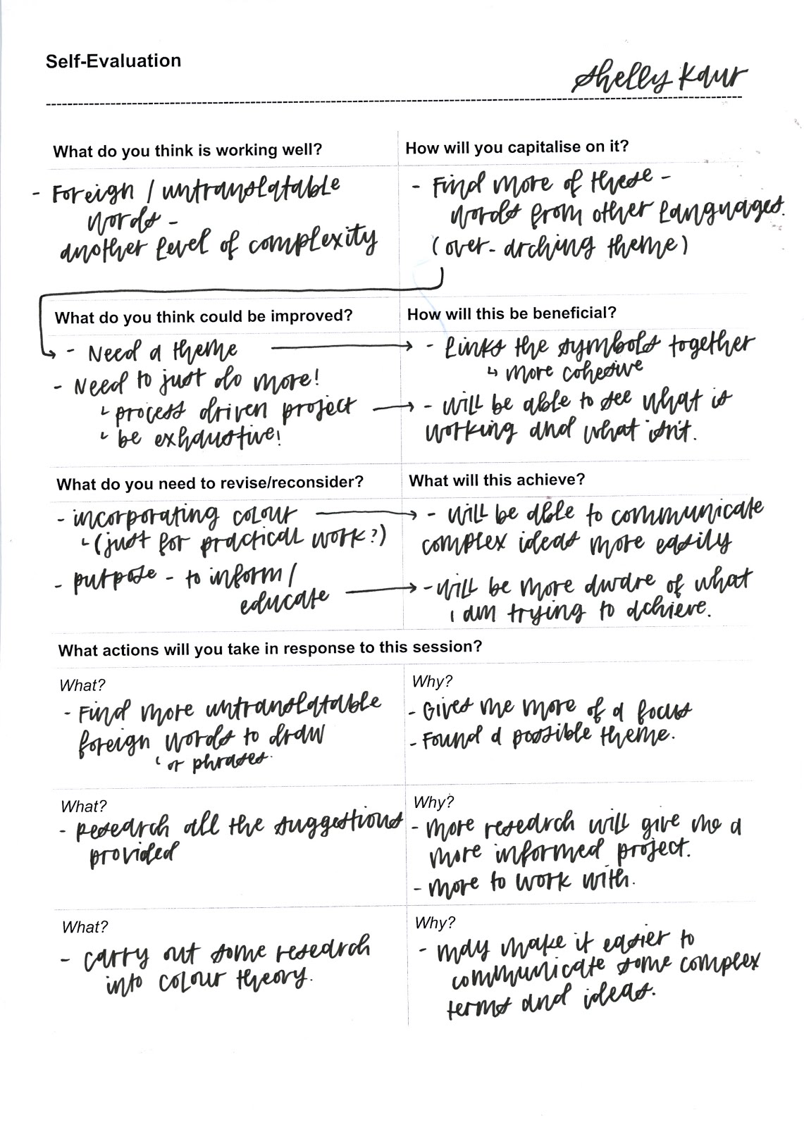
Most of the comments were to do with the purpose and function of the symbols I am trying to create. This isn't something I was really thinking about yet as I wanted to just get cracking with simplifying some verbs to start me off. A possible outcome discussed with Jamie in a previous tutorial was to create a dictionary of symbols. One of my peers mentioned this idea being a bit too ambitious and the need to pick a theme. This is something I need to sit and think about properly, or something that could potentially come to me a little later, once I have done more practical work. 

Questions:
  • 'Will you use/ consider colour, animation?' - I discussed in a previous group tutorial not to look into colour and just to look into form. However, this was more for the purpose of focusing my essay question more. I could still potentially look into colour for the practical work. Animation could be a good idea. 
  • 'What is the function? Playful, educational, will you lose tone of voice?' - Visual metaphors have been used often in my tests so far as it makes it easier to communicate lots of things in one. I believe this naturally makes them quite playful. Need another function also, but not sure of this yet.
  • 'Maybe impose a limit on quantity, a dictionary of symbols could be exspansive.' - need to choose a specific theme. 
  • 'Could you implicate colour or method into this?' - see answer to first question. I haven't thought about process yet. Most symbols I've seen are digital (vectors). Stick with this or choose something analog to make it different?
  • 'What are the links between the words?' - Again, need to choose a specific theme. 

Suggestions (to research):
  • Look into the development of the radioactive symbol.